Bikingham
Bellingham, WA is full of cyclists. As the biking population grows with the city, so does the need for a wayfinding app catered just for riders. I designed this hypothetical app for riders that acts as a fitness tracker, map and more! I went through the process of researching the specific demographic in order to create the most efficient and helpful interface.


Testing
Methods and Process
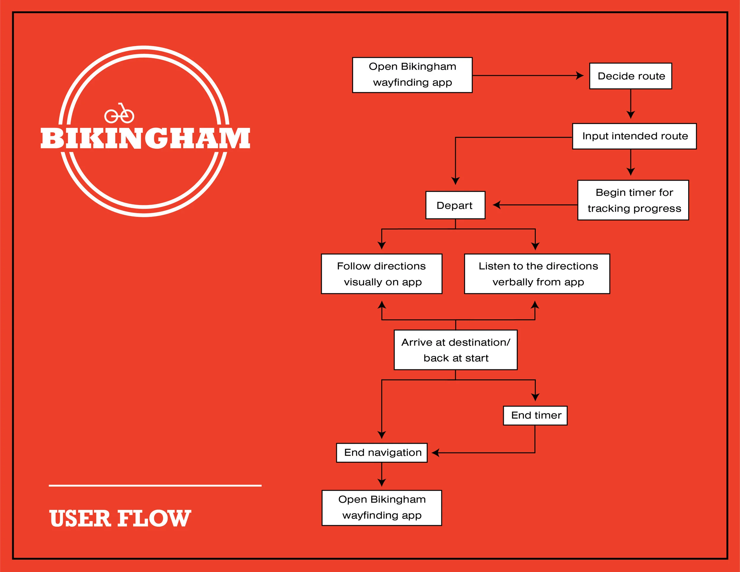
To test the usability of my prototype for the hypothetical app Bikingham, I called upon a peer who bikes often to be my subject. We started out with a brief introduction of the app and its purpose, and from there I asked them to decide a route to ride and use the app to navigate as they would naturally. I used the program InVision in order to create a low-fidelity prototype, which my tester used to simulate a consumer navigating the interface. Since we weren’t able to do this in person, I asked them to think aloud so if anything came up that made usability difficult, I could easily identify it so I could fix it.
Throughout the test, the participant didn’t run into many hiccups; they were able to accomplish their goal without confusion. After the participant completed their goal, we did a short debrief and I thanked her for her feedback. They had some suggestions on features that users would probably prefer, which I will touch on in the following section.
Results and Observations
After conducting this test, I felt like the general usability went according to plan. The tester did, however, have some really useful feedback that I believe would increase the user’s experience. They thought the Explore page would make more sense as a page where you can see what routes other people around you are doing. You could then save and try those routes yourself. Making the app have a social aspect to it in the future might incentivize people to use the app more often by adding an aspect of community, or even competition, to the app.
The tester also thought there wasn’t much use having the “Draw your Route” page separate from where you input your start and end points. We felt it made more sense for there to be a button on the side of a standard map interface that prompts an option to draw your route. This made me realize that the navigation is a little clunky, so in making some improvements I would make everything more concise and even more minimal.
want to see the prototype?
YES!! / No, I’m okay